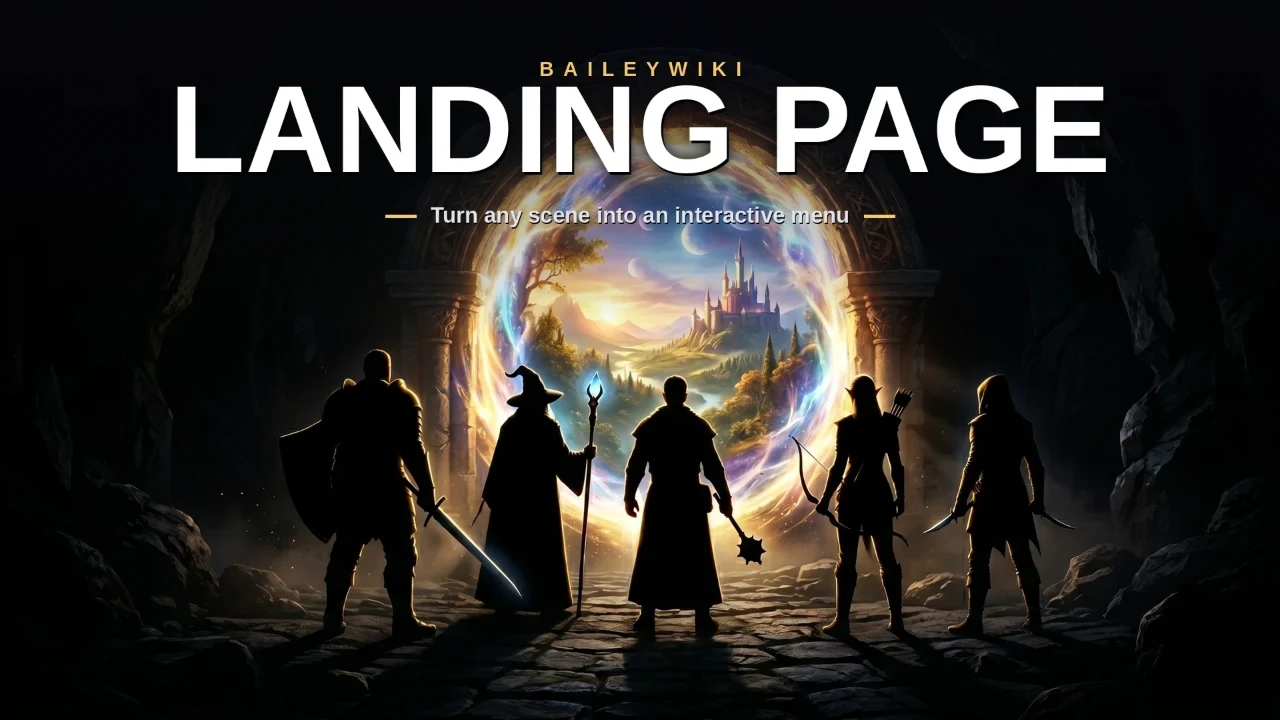
Baileywiki Landing Page
by Baileywiki
A free module to create fully interactive landing pages in Foundry with per-player hover effects, image swaps, sound, selector markers, click actions, automated layouts, backdrops, custom tile interactions, and more.
Turn any scene into a beautiful, interactive front door for your game.
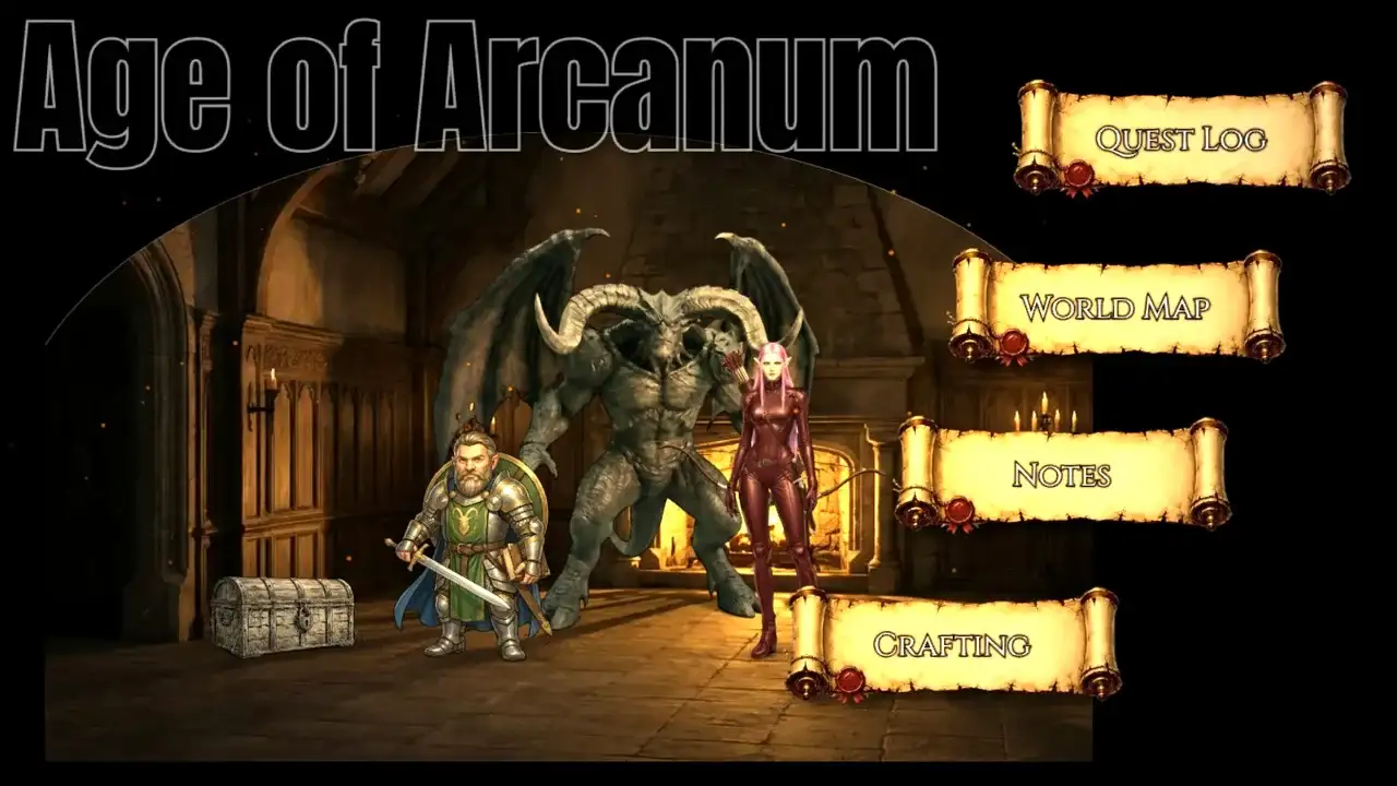
Build a party HQ, a quest hub, a chapter splash, or a session menu — a gridless scene with gorgeous, hoverable, clickable buttons that open your Journals, character sheets, roll tables, macros, or jump to other scenes. Your players land somewhere that feels designed, not just dropped onto a battlemap.
The whole thing is additive to Foundry: buttons are ordinary Tiles, labels are ordinary Drawings. Nothing exotic, nothing locked away — so Token Magic FX, Mass Edit, snapping, and the native Tile HUD all keep working on everything you make. And while you can use Monk's Active Tiles freely, you don't NEED it. The module has the click and effect functions built-in.
Looking for ways to create landing page elements and character poses? Try MadProps (Scenes and props), TurnSheet (Characters), and BatlGrid (Top-down props)
🎬 LOOKING FOR A TUTORIAL?
New for 2.0 — watch the full video walkthrough: Landing Page 2.0 Tutorial.
Prefer to read? The full written guide is Here.
🚀 New in 2.0
Inverted & greyscale-until-hover. Any effect can run in reverse — the standout being artwork that sits in black & white and pops into full colour the instant a player points at it.
Hover-image swap. A button (or any tile) switches to an alternate picture on hover and back on leave — per player, stacking with every other effect.
Invisible (label-only) buttons for clean, art-forward menus, with a Design-Mode outline so they stay easy to grab.
Sound. Per-player hover & click sounds from a bundled CC0 library (or your own upload), plus looping or one-shot scene music.
Selector markers — underline, diamond, brackets and more — that mark the hovered button, with an always-on "you are here" pin.
Lock screen & immersive front door. Frame the scene with an adaptive view, optional pan/zoom locks, launch-unpaused, and immersive mode — plus a GM Preview User View to see exactly what players see.
One linked menu. Drag any button to move the whole menu together, or pull it into Mass Edit's preview to scale/reposition as a unit.
✨ Highlights
One-click Designer. A single panel builds the whole page: pick a layout (top/bottom row, left/right panel), choose which buttons to create, and hit Build. Tweak any part live afterward — no rebuild required.
A growing library of button art in a visual, searchable browser — fantasy scrolls, stone, wood, iron, ice, arcane filigree, sci‑fi panels and more. Filter as you type, click to preview, select. Or design and upload your own buttons!
Recolor everything instantly. Color schemes (Gold, Arcane, Cyan, Crimson, Slate) or a fully custom color with a picker and an on‑screen eyedropper. Two‑tone buttons recolor just their accent so the frame stays intact.
Per‑player hover effects. Glow, any Token Magic FX preset, a direct text‑colour change, or an image swap — each shown only to the player whose cursor is on the button, and each able to run inverted (on at rest, clears on hover).
Click actions that matter. Open a Journal, a character sheet, a roll table, run a macro, or send each player to another scene (great for a clickable World Map).
Beautiful labels. Any installed font — or import fonts straight from Google Fonts, which become available to your regular Drawings too (and auto‑load for every player). Control color, size, opacity, stroke, and offset; labels can even appear only on hover.
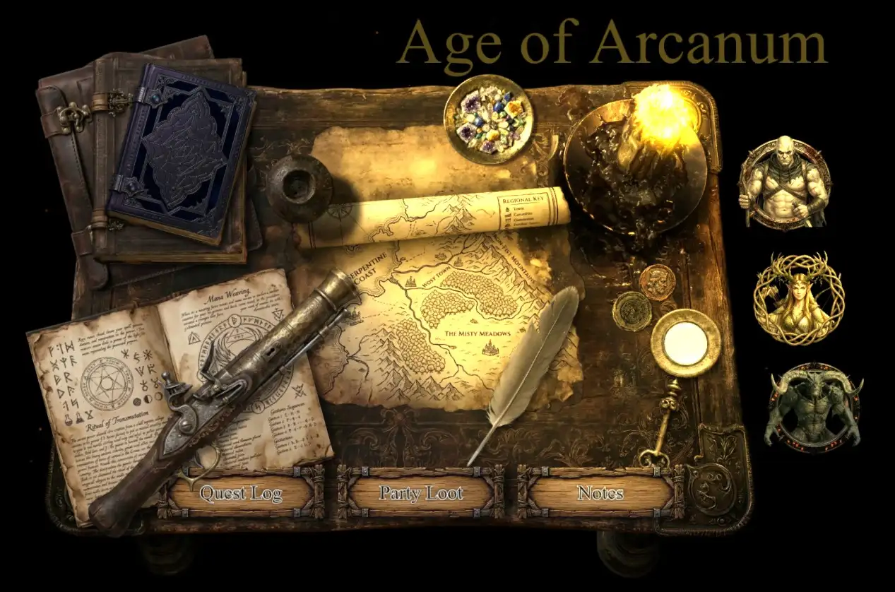
Shaped scene backdrops. Drop your splash art inside a circle, square, or arched frame instead of a flat rectangle, and the module can generate the scene thumbnail straight from it.
Polish toggles. Soft drop shadows, hover‑only labels, pixel‑perfect hit detection on hand‑placed art, and a per‑scene “launch unpaused” option so animated landing pages come up live.
🛠️ How it works
Engage the landing page design panel for the first time from your Tiles menu: Landing Page Panel
You stay in control of a normal scene. The Designer drops button Tiles and label Drawings for you, wires each button's hover effect and click action, and links every label to its button so they move together as a prefab (while a label can still be nudged on its own). A lightweight, design‑mode‑gated interaction layer drives the hover glow and clicks for players — and gets out of your way while you author.
Because it's all native documents, you can hand‑place extra buttons, restyle in seconds, export/import the scene with Foundry's own tools, and lean on the modules you already use.
📋 Compatibility & recommended modules
Foundry VTT v13–v14. System‑agnostic at its core (built and tested with D&D 5e).
Token Magic FX (required) — powers the per‑player hover effects, compound effects, drop shadow, two‑tone recoloring, and the shaped backdrop overlay.
Mass Edit (recommended) — links each button to its label, and lets you move or preview the whole menu as one.
FXMaster (recommended) — ambient particle effects for extra atmosphere.
💜 From Baileywiki
Made by Baileywiki. If you love rich, ready‑to‑play VTT content, come say hi — and bring your table somewhere worth landing.
Contents not yet indexed.
Releases
## 2.0.0 — 2026-08-13 The biggest update yet. Landing Page turns a Foundry scene into a fully interactive, per-player front door — invisible buttons, rich hover effects, sound, and a locked "intro screen" feel — all authored from one Designer panel. ### Interactive hover (the headline) - **Per-player hover effects.** A glow, any Token Magic FX preset, or a direct **text-colour change** — each seen only by the player pointing at the button, with no GM online and no flag writes at play time. - **Inverted (reverse) hover — art that pops into colour.** Any effect can run *backwards*: shown at rest and **cleared on hover**. The showcase is **greyscale-until-hover** — a button's art sits in black & white and snaps into full colour the instant the cursor lands on it. One-click setup via the **Black & white until hover** button. - **Hover-image swap.** A button (or any custom tile) switches to an alternate picture on hover and back on leave — per-player, stacking with every other effect, with its own invert (show the alternate at rest, the original on hover). Set per tile or scene-wide. - **Hover on labels & any text.** Invisible buttons can light up their *label* text on hover — recolour, opacity, and lettering stroke. - **Mix and fine-tune.** Effects stack freely, each with its own **invert** and a **settings gear** to tune colours, strengths, blur, and more per button or label. - **One tidy panel.** Everything "on hover" now lives together — glow, image swap, and hover sound — with the long TMFX filter list moved into its own **Edit effects…** modal. Push changes to every button live with **Apply hover effects**, no rebuild required. ### Buttons & layout - **Invisible (label-only) buttons** — the art disappears so only the text shows over your own background; a dashed Design-Mode outline keeps them easy to grab. - **The whole menu is one linked set** — drag any button to move the entire menu together, or select one button and pull the whole menu into Mass Edit's preview to free-scale/reposition it as a unit. - **Button-set X/Y offset** — place the menu exactly where you want over your art, applied on build or slid live with **Apply offset**. - **Lock a button** so Rebuild leaves it exactly as you tuned it (position, style, click, hover, label all preserved). - **Label text controls** — opacity plus a lettering-stroke override (set width to 0 to remove Foundry's default stroke, or choose your own). ### Markers - **Selector marks** that appear on a label on hover — underline, double-underline, frame, dot, flanking dots, diamond, flourish, or brackets — recolourable and auto-sized to the text. Pin one **always-on** as a "you are here" indicator. ### Sound - **Per-player hover & click sounds** from a bundled ~176-clip CC0 library (UI / Fantasy / Sci-Fi), browsable with click-to-preview — or **upload your own audio**. - **Scene music that loops or plays once** — seamless crossfade loop, or a one-shot that plays on first view and stays quiet. ### The "intro screen" feel - **Lock screen** — frame the scene with an **adaptive view** that fits every player's screen (no black bars), with optional **pan/zoom locks**, **Launch unpaused**, and **Immersive mode** (hides Foundry chrome) — all in one place, players-only (the GM always moves freely). - **Preview User View** — a GM toggle that flips the scene into exactly what a player sees (saved view, locks, immersive, buttons live on mouse-over), leaving just the helper panel; closing it snaps you back to your normal GM view. ### Text & fonts - **Text-stroke control on any Foundry text drawing**, not just module labels. - **Google fonts auto-load for every player** on scene load — no manual refresh. ### Samples & docs - **New sample: The Rise of Erebus** — a fantasy-city landing page showcasing invisible buttons, markers, a text-colour hover, and custom art. - **Unified demo journal** — all samples share one generic journal and build consistently on import; no dead clicks. - **Online how-to guide** — a full step-by-step guide, linked from the module Settings and every demo journal page. ### Housekeeping - **Token Magic FX is now required** (it drives the hover effects, drop shadow, and two-tone buttons); **Baileywiki Mass Edit** and **FXMaster** are recommended companions. - **Module settings are GM-only** — players no longer see any Landing Page settings. - **The helper panel remembers when you close or minimize it** and only auto-opens on actual landing-page scenes (one click from the Tiles button anywhere else). - Polish: label sizing, Designer accordion behaviour, clearer section names.
## 0.34.50 — 2026-07-20 ### Fixed - **Re-importing a sample now adds demo journal pages introduced in a later release.** The importer reuses the demo journal already in your world, so the Downtime, Shop and Rules pages added in 0.34.49 never appeared for anyone who had imported a sample before. Re-importing now tops up any missing pages. Pages are matched by name, so anything you have edited, renamed or written yourself is left untouched.
## 0.34.49 — 2026-07-20 ### Fixed - **A stale Category Default no longer kills a button.** If a default pointed at a journal that had since been deleted or renamed, the button died even though a perfectly good fallback existed behind it — which is why an imported sample could end up with only one working button. Every candidate target is now checked before use, and a target that no longer exists is skipped in favour of the next option (the button's own action, the link it shipped with, or a name match). Valid defaults still take precedence exactly as before. - **Sample buttons you enable later now work.** The bundled samples only ship links for the buttons they come with, so switching on Downtime, Shop, Rules or World Map afterwards and rebuilding left dead buttons. Both demo journals now include a page for every standard category, and a button with no other target falls back to the demo page matching its name. This applies to already-imported sample scenes too — no re-import needed.
2.0.0 — 2026-08-13
The biggest update yet. Landing Page turns a Foundry scene into a fully interactive, per-player front door — invisible buttons, rich hover effects, sound, and a locked "intro screen" feel — all authored from one Designer panel.
Interactive hover (the headline)
- Per-player hover effects. A glow, any Token Magic FX preset, or a direct text-colour change — each seen only by the player pointing at the button, with no GM online and no flag writes at play time.
- Inverted (reverse) hover — art that pops into colour. Any effect can run backwards: shown at rest and cleared on hover. The showcase is greyscale-until-hover — a button's art sits in black & white and snaps into full colour the instant the cursor lands on it. One-click setup via the Black & white until hover button.
- Hover-image swap. A button (or any custom tile) switches to an alternate picture on hover and back on leave — per-player, stacking with every other effect, with its own invert (show the alternate at rest, the original on hover). Set per tile or scene-wide.
- Hover on labels & any text. Invisible buttons can light up their label text on hover — recolour, opacity, and lettering stroke.
- Mix and fine-tune. Effects stack freely, each with its own invert and a settings gear to tune colours, strengths, blur, and more per button or label.
- One tidy panel. Everything "on hover" now lives together — glow, image swap, and hover sound — with the long TMFX filter list moved into its own Edit effects… modal. Push changes to every button live with Apply hover effects, no rebuild required.
Buttons & layout
- Invisible (label-only) buttons — the art disappears so only the text shows over your own background; a dashed Design-Mode outline keeps them easy to grab.
- The whole menu is one linked set — drag any button to move the entire menu together, or select one button and pull the whole menu into Mass Edit's preview to free-scale/reposition it as a unit.
- Button-set X/Y offset — place the menu exactly where you want over your art, applied on build or slid live with Apply offset.
- Lock a button so Rebuild leaves it exactly as you tuned it (position, style, click, hover, label all preserved).
- Label text controls — opacity plus a lettering-stroke override (set width to 0 to remove Foundry's default stroke, or choose your own).
Markers
- Selector marks that appear on a label on hover — underline, double-underline, frame, dot, flanking dots, diamond, flourish, or brackets — recolourable and auto-sized to the text. Pin one always-on as a "you are here" indicator.
Sound
- Per-player hover & click sounds from a bundled ~176-clip CC0 library (UI / Fantasy / Sci-Fi), browsable with click-to-preview — or upload your own audio.
- Scene music that loops or plays once — seamless crossfade loop, or a one-shot that plays on first view and stays quiet.
The "intro screen" feel
- Lock screen — frame the scene with an adaptive view that fits every player's screen (no black bars), with optional pan/zoom locks, Launch unpaused, and Immersive mode (hides Foundry chrome) — all in one place, players-only (the GM always moves freely).
- Preview User View — a GM toggle that flips the scene into exactly what a player sees (saved view, locks, immersive, buttons live on mouse-over), leaving just the helper panel; closing it snaps you back to your normal GM view.
Text & fonts
- Text-stroke control on any Foundry text drawing, not just module labels.
- Google fonts auto-load for every player on scene load — no manual refresh.
Samples & docs
- New sample: The Rise of Erebus — a fantasy-city landing page showcasing invisible buttons, markers, a text-colour hover, and custom art.
- Unified demo journal — all samples share one generic journal and build consistently on import; no dead clicks.
- Online how-to guide — a full step-by-step guide, linked from the module Settings and every demo journal page.
Housekeeping
- Token Magic FX is now required (it drives the hover effects, drop shadow, and two-tone buttons); Baileywiki Mass Edit and FXMaster are recommended companions.
- Module settings are GM-only — players no longer see any Landing Page settings.
- The helper panel remembers when you close or minimize it and only auto-opens on actual landing-page scenes (one click from the Tiles button anywhere else).
- Polish: label sizing, Designer accordion behaviour, clearer section names.
0.34.50 — 2026-07-20
Fixed
- Re-importing a sample now adds demo journal pages introduced in a later release. The importer reuses the demo journal already in your world, so the Downtime, Shop and Rules pages added in 0.34.49 never appeared for anyone who had imported a sample before. Re-importing now tops up any missing pages. Pages are matched by name, so anything you have edited, renamed or written yourself is left untouched.
0.34.49 — 2026-07-20
Fixed
- A stale Category Default no longer kills a button. If a default pointed at a journal that had since been deleted or renamed, the button died even though a perfectly good fallback existed behind it — which is why an imported sample could end up with only one working button. Every candidate target is now checked before use, and a target that no longer exists is skipped in favour of the next option (the button's own action, the link it shipped with, or a name match). Valid defaults still take precedence exactly as before.
- Sample buttons you enable later now work. The bundled samples only ship links for the buttons they come with, so switching on Downtime, Shop, Rules or World Map afterwards and rebuilding left dead buttons. Both demo journals now include a page for every standard category, and a button with no other target falls back to the demo page matching its name. This applies to already-imported sample scenes too — no re-import needed.
0.34.48 — 2026-07-20
Changed
- Button targets are now worked out at click time, not baked in at build time — no rebuild needed. Change a Category Default in Settings and every matching button obeys it on the very next click. Each button resolves in a fixed order: the click action you set on that specific tile, then the Category Default for its category, then the link it shipped with (a bundled sample's demo journal), then a live name match. That last step means simply creating a journal named "Quest Log" or a scene named "World Map" makes those buttons work immediately, even on landing pages built by earlier versions.
- Imported samples work out of the box and still respect your defaults. A freshly imported sample opens its own bundled demo journals, because that's the link it ships with. If you've set your own Category Defaults, those win instead — no import, rebuild, or reconfiguration required either way.
- Clearing a button's click action no longer kills it. It now falls back to your Category Default, or the link it shipped with, instead of leaving the button dead.
- Note for existing landing pages: on pages built before this update there was no record of which button clicks you had set by hand, so those are treated as automatic and a matching Category Default will take precedence. If a button should keep its hand-set action, open its Click Action from the Tile HUD and save it once — it is then marked as explicit and always wins.
0.34.47 — 2026-07-20
Fixed
- Imported sample landing pages now link to their own demo journals again. If you had already set your own Category Defaults in Settings, importing a sample replaced its bundled demo links with those defaults — so the sample's buttons opened the wrong thing, or nothing at all. A sample import now always wins with its own self-contained links, so the scene works the moment it lands. Your Category Defaults still take over the next time you Build / Rebuild from the Designer, so overriding them works exactly as before. (Regression introduced in 0.34.45.)
- The Sewer sample no longer loses its "Party Loot" button on import. The button was seeded in the scene but its category wasn't enabled in the sample's builder config, so the import deleted it and never rebuilt it.
0.34.46 — 2026-07-20
Fixed
- Sample scene embers were too large and too fast. Both bundled samples shipped FXMaster ember particles with oversized, quick-moving settings — the Writing Desk at scale 1 / speed 0.5 and the Sewer at 0.6 / 0.3. Both now use scale 0.2 / speed 0.23, for a slower, finer drift that suits the scenes. Each sample keeps its own tint and density. Affected v13 and v14 identically, since both variants carried the same values.
0.34.45 — 2026-07-20
Fixed
- Default buttons (Quest Log, World Map, Party Loot) could be permanently dead. If a button was built before its target existed — no journal named "Quest Log", no scene named "World Map" — it was saved with an empty link, and a rebuild preserved that empty link. Creating the document afterwards, or pointing the category at one in Settings, made no difference: the dead link survived every rebuild. Empty links are no longer preserved, and an explicit target set in Settings now takes precedence over a preserved one, so reconfiguring a category actually takes effect. Hand-set click actions on individual tiles are still preserved across rebuilds as before.
- Buttons with no target now say so. Clicking an unlinked button did nothing at all — no message, no console entry — which is why these dead buttons went unreported for so long. It now tells the player the button isn't linked yet, and tells the GM where to set a target.
0.34.44 — 2026-07-20
Fixed
- Restored the Designer's "Build / Rebuild menu" button, the "Set scene audio" button, and the Extras section, which went missing in 0.34.43. Two template files (
builder.hbs,scene-design.hbs) were packaged while still being written to disk, so each shipped ~500 bytes short and simply stopped mid-section — taking the footer button with them. The templates themselves were always correct; only the packaged copies were incomplete. Releases are now verified against the uploaded archive before being announced.
0.34.43 — 2026-07-17
Added
- Designer audio: "Play sound file" + loop toggle. The Scene audio section (in both the Designer and Scene Design) now has a Play sound file field — a true file path with a Browse/Upload picker, like the default path in Settings — to attach a single ambient audio file to the landing scene, separate from the Playlist/Track fields. A Loop the sound file toggle (on by default) controls whether it repeats. The sound plays locally for every player who views the landing page, on the environment audio channel so the ambient-volume slider scales it.
0.34.42 — 2026-07-11
Changed
- Sample scenes no longer require FXMaster. The bundled samples use an FXMaster region behavior for their ambient ember particles. FXMaster is now a recommended (optional) module rather than a silent hard dependency, and it's declared as such in the manifest.
Fixed
- Importing a sample without FXMaster installed no longer errors or produces a broken scene. A region behavior is a module-supplied document subtype, so if the module that provides it isn't active, Foundry can't construct it and the whole import fails. The importer now drops any region behavior this world can't build, tells the GM which module was missing, and imports the scene cleanly — everything else (buttons, backdrop, hover, journal links) works exactly as before. Install FXMaster and re-import to get the embers back. The check is generic (it covers any third-party region behavior, not just FXMaster's) and behaves identically on v13 and v14.
0.34.41 — 2026-07-07
Added
- Player-access check. A landing page is a front door for players, so after you Build the module now checks whether the documents its buttons link to (journals, actors, scenes, tables) are readable by players, and offers a one-click grant to Observer for any that aren't. There's also a "Check player access" button in the panel to run it on demand.
Fixed
- Whole-journal button links now open. A button pointing at a whole Journal Entry (e.g. a category default configured in Settings) opened a blank sheet on v14; it now opens to the journal's first page. Buttons pointing at a specific journal page already worked. (Not system-specific — affects dnd5e too.)
- System-agnostic label font. Generated button labels fall back to an available font when the style's default (dnd5e's "Modesto Condensed") isn't present in the world's system, so labels render properly outside dnd5e. (Click actions were already system-agnostic — pure Foundry core.)
0.34.40 — 2026-06-26
Added
- “Show credit links” setting (world, default on) that hides the credit links at the bottom of the Landing Pages panel when turned off.
- BatlGrid credit link — “Top-down Assets: batlgrid.ai” — added to the panel credits alongside turnsheet.ai and madprops.ai.
0.34.39 — 2026-06-26
Added
- Built-in sample landing pages — “Sewer Adventure” and “Writing Desk.” Import them from the helper panel’s Samples button as ready-made, fully-editable starting points you can change freely. Each is a real scene, not a flat import: the menu buttons are generated by the module’s own Builder (so restyling, relabeling and rebuilding behave exactly as on a hand-built page), the custom art and backdrop are hand-placed, and every button is wired to a self-contained demo journal. They ship as version-matched v13 and v14 layouts and are picked automatically for your Foundry version so they render correctly on either.
- Designer “Scene base” section at the top of the Designer: set one image and choose how it fills the scene — a traditional Background or a shaped Backdrop tile (circle / arch / square) — plus a Background color picker. Switching modes cleans up the other.
- “Change Tile Image” HUD button (Design Mode): swap any tile’s art while preserving its width and recomputing height from the new image’s aspect ratio — no stretching; works for images and video.
- “Button X/Y offset % (Foundry v14)” setting: a configurable, scene-proportional nudge for generated buttons on v14 only (v13 untouched).
Changed
- The main Build / Rebuild button now applies the entire Scene base (background image, backdrop tile, and background color), not just the buttons.
- Sample menus are generated by the module’s button builder rather than baked tiles, so an import is identical to a Designer build and rebuilding changes nothing.
Fixed (mostly Foundry v14 compatibility)
- Scene background image and color set correctly on v14, where they moved onto a Level embedded document
(the deprecated
Scene#background/backgroundColorare no-ops there). Sized to the scene so they fill. - Token Magic FX effects (backdrop sprite, drop shadows, two-tone tint, per-client hover) replay through TMFX’s live API on import instead of being purged for stale placeable IDs.
- Button centering for rows and panels on v14, with the configurable per-scene offset above for v14’s positioning quirk.
- Backdrop placement on v14 (its TMFX sprite renders ~half a tile up-left; new backdrops are anchored to compensate, so they land centered).
- Label anchoring so sample text lands identically on v13 and v14.
- Consistent button sizing across every layout; a scene thumbnail is generated for backgroundless v14 scenes; and the Designer no longer logs a v14 deprecation warning.
0.34.38
- Fixed: the main Build / Rebuild button now also applies the Scene base section — the background image, backdrop tile, and background colour — instead of only rebuilding the buttons. (The section's own Apply button still works on its own too.)
- Fixed: switching from Background to Backdrop tile now places the backdrop centered on v14. v14's Token Magic FX sprite renders ~half a tile up-left of the tile, so a newly created backdrop tile is now anchored with its top-left at the scene center to land the visible backdrop dead-center (v13 keeps centering the tile normally).
0.34.21
- New: the helper panel now has an explicit close (×) button in its header, alongside minimize. Closing fully dismisses the panel — reopen it from the scene‑controls button — and it no longer reappears on scene change once closed.
GET /api/v1/modules/baileywiki-landing-page/changelog?channel=stableComments(0)
Sign in to join the discussion.